Project specifics
- Role: Lead Web Developer
- Application type: Blog
- Application category: Informationstechnologie
Client information
Die erste Version meiner Webseite habe ich 2010 mit WordPress 2.9 erstellt. Seitdem WordPress 3.0 veröffentlicht wurde hat sich viel in der WordPress-Architektur verändert. Ich war daran interessiert diese Verbesserungen auszutesten und darüber hinaus meine Webseite für alle Auflösungen der möglichen Endgeräte anpassbar zu machen (responsive).
Entgegen meiner Erwartung war die reine Software-Entwicklung der einfachste Teil. Die meiste Zeit hat die Planung in Anspruch genommen um zu entscheiden wie das Backend aufgebaut werden muß um das Eintragen der Inhalte möglichst komfortabel zu gestalten. Dahingehend bietet WordPress einfache aber mächtige Programmier-Strategien an. Ich begann die Entwicklung des Backends per Shortcodes zu erweitern, bis ich erkannte welche Inhalte ich für bestimmte Beitragstypen (engl. Post-Types) immer wieder brauchte. Anschließend änderte ich meine Entwicklungs-Strategie und setzte Meta-Boxen ein. Diese stelle ich als Plugins zur Verfügung um sie jederzeit ein- und ausbauen zu können. Natürlich muss man diese Entscheidung vom Anwendungsfall abhängig machen. Muss z.B. ein Theme entwickeln wobei die wichtigste Anforderung auf der Anpassbarkeit der Oberfläche für Nicht-Programmierer besteht, sind Shortcodes das bessere Mittel. Der Anwender kann über den Text-Editor im Backend selbst entscheiden an welcher Stelle im Frontend er einen bestimmten Inhalt anzeigen will. Die eigentliche Quellcode-Generierung wird dem Anwender jedoch abgenommen.
In meinem Fall habe ich angepasste Beitragstypen – Projekte (Abb. 01) und Designs – erstellt deren Inhalte zügig über jeweilige Kontroll-Elemente (Checkboxen, Radio-Buttons, etc.) gefüllt werden können (Abb. 02, Abb. 03).
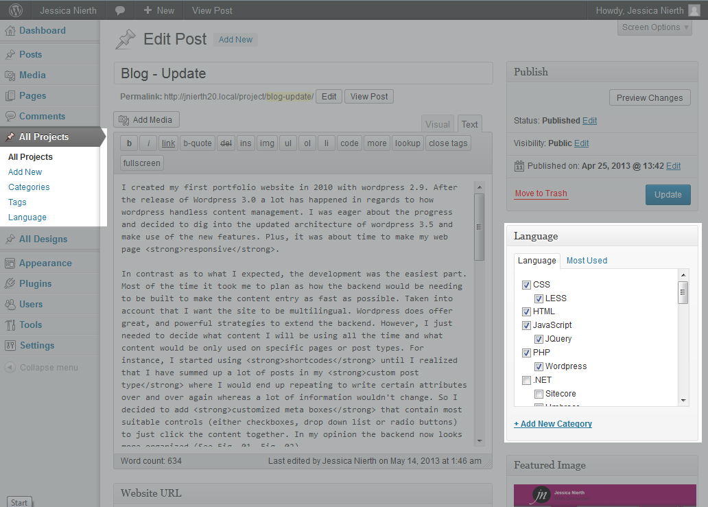 Fig. 01
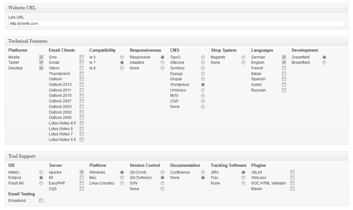 Fig. 02
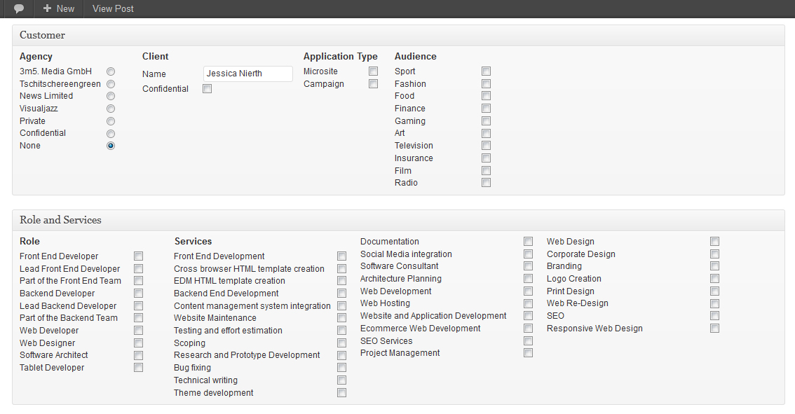 Fig. 03
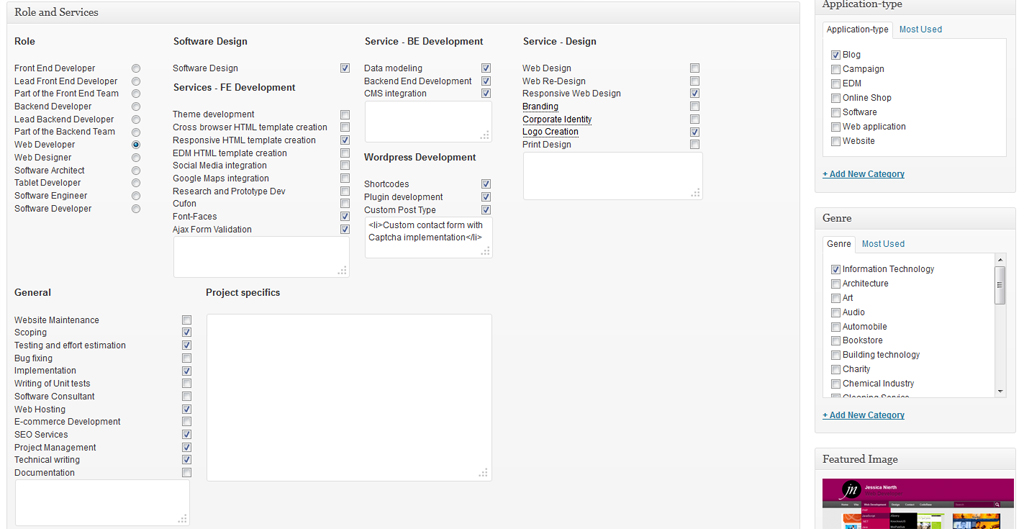 Fig. 04
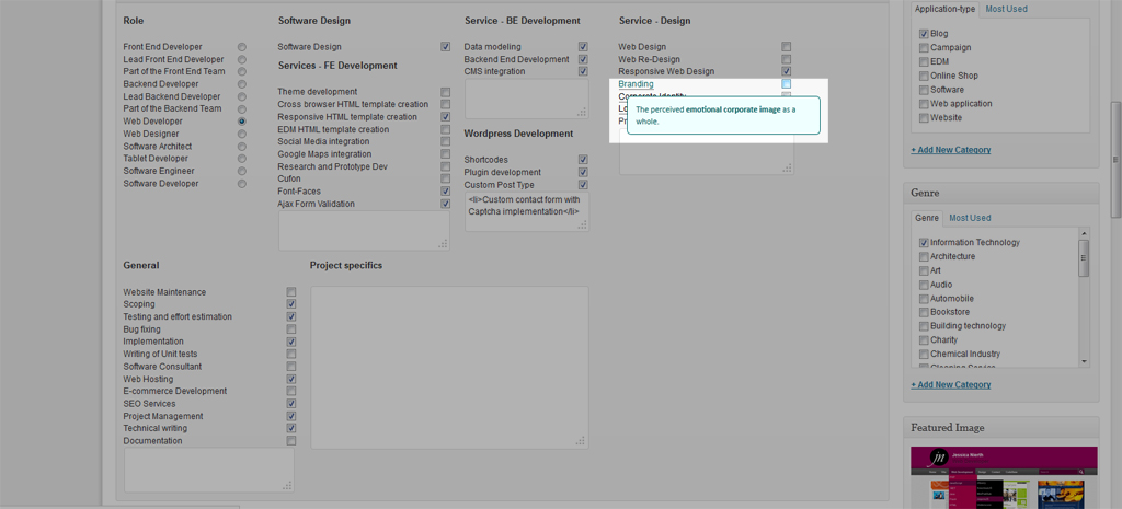 Fig. 05
Es ist mir auch wichtig immer das richtige Werkzeug zu verwenden. Hierzu habe ich Mikroformate eingesetzt um eine standardisierte Formatierung der Inhalte anzuwenden. Leider werden Mikroformate nicht in dem Grad unterstützt der mir lieb wäre aber Fakt ist: Die Verwendung von Mikroformaten ist einfach, sie führen nicht zu Seiten-Effekten wenn der Browser das Format nicht kennt aber wenn es bekannt ist, bieten sie große Vorteile. Es gibt z.B. Plugins für den Browser welche die Informationen der Mikroformate auslesen und in andere Formate exportieren oder in Anwendungen eintragen können. So können z.B. Kontakt-Daten oder Ereignis-Daten in das persönliche Adressbuch eingetragen werden (siehe [1]). In wiefern diese Formate in Zukunft einen positiven Einfluss auf Suchmaschinenoptimierung haben ist noch abzuwarten.
Um JavaScript nur als Erweiterung zu verwenden, habe ich mich bemüht weitestgehend auf andere Mittel auszuweichen. So basieren auf dieser Seite eingesetzte Bilder-Gallerien komplett auf CSS3 bis zum Internet Explorer 7. Für alle älteren Browser wird die Darstellung entsprechend angepasst so dass die Seite immer noch funktionsfähig ist (vergleiche Abb. 06 mit Abb. 07). Darüber hinaus habe ich das Navigationsmenü per ‘off-canvas’ Methode integriert. Diese Methode hat den Vorteil dass sie auf dem nativen CSS Selektor :target basiert. Animationen können natuerlich im Nachhinen mit CSS 3 oder JavaScript hinzugefügt werden.
 Fig. 07
 Fig. 08
Die Performanz betreffend werden alle Bilder dem Endgerät entsprechend ausgeliefert, so ist die maximale Breite der Bilder für mobile endgeräte 240px, für Tablets 575px und für Desktops 960px. Des Weiteren habe ich sog. Sprites eingesetzt um die Anzahl von Requests zu minimieren.
test
[1] https://addons.mozilla.org/En-us/firefox/addon/operator/
Technical Features
- Platforms: Mobile, Tablet, Desktop
- Project Group: Greenfield
- HTML5: Yes
- Responsiveness: Responsiv
- Browser Compatibility: IE9+
- CMS: WordPress
Tool Support
- IDE: IntelliJ
- Server: Apache
- Platform: Windows
- Version Control: Git (Tortoise)
Project specifics
- Role: Lead Web Developer
- Application type: Blog
- Application category: Informationstechnologie
Client information
My Services
- Frontend Services
- Theme development
- Responsive cross browser compatible HTML template creation
- Ajax form validation
- Backend Services
- Development of the backend
- CMS integration
- Web Design Services
- Web Design
- Corporate Identity
- Logo creation
- General services
- Website Maintenance
- Deployment